PUNCHLINE PROFIT Branding by BRID
- Jun 17
- 2 min read
BRID is a team of young professionals who create Brand identity that leaves fingerprints on the market & the minds of your customers, so their numbers grow by leaps & bounds. Our goal is to pay special attention to each client, providing them with a high-quality final product. To achieve these results. Let's start creating your brand ID
Client
PUNCHLINE PROFIT
Service
STRATEGY, LOGOTYPE, BRANDING, MOTION
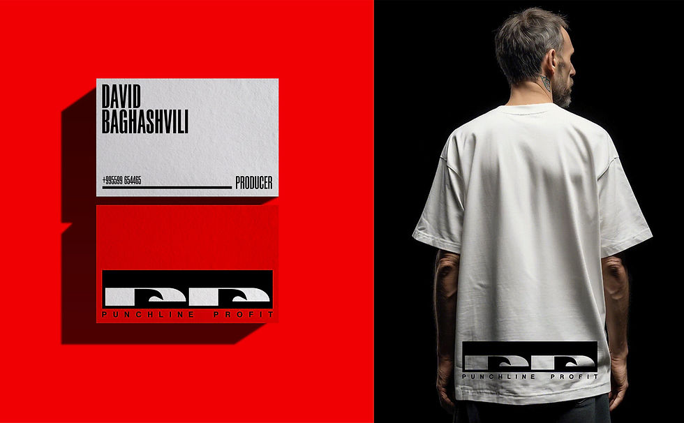
Punchline Profit is a media platform built on a single conviction: that entrepreneurs don't need more motivation - they need movement. This identity system has been designed to carry that conviction across every surface it touches, from a YouTube thumbnail to a stage banner.
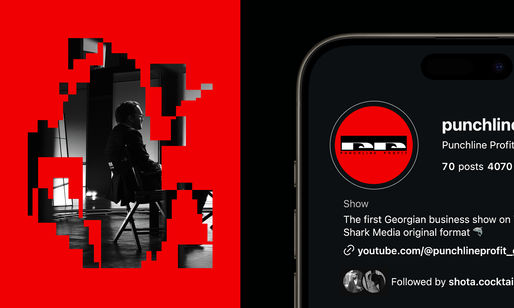
The key visual concept places a person behind the Punchline Profit eye frame - cropped precisely at the eyes. It is a threshold image. On one side: the spectator - watching, observing, waiting. From the other: the participant - confronted, clarified, moved. The frame is not a decoration. It is the brand's core tension made visible: the moment before understanding arrives, and the person about to receive it.
Core Idea
The logo resolves the central tension of the brand: Entrepreneurs avoid looking directly at their real problem.
Punchline Profit forces the gaze. The mark transforms the initials “PP” into a pair of observing forms - creating the feeling of being watched, explored, and confronted.
The structure balances the Hero's confrontation, the Sage's precision, and the Jester's tension and movement.

Symbol Meaning
The symbol is constructed from the initials “PP”, each letter reshaped into an abstract eye form.
This dual structure represents:
The audience observing the show and themselves
The host observes the guest and vice versa
The show observes the clarity and truth
Two eyes - not one - reinforce dialogue, rather friendly tension, and exchange.


Follow BRID & Designmadein.ge on Instagram


Comments